
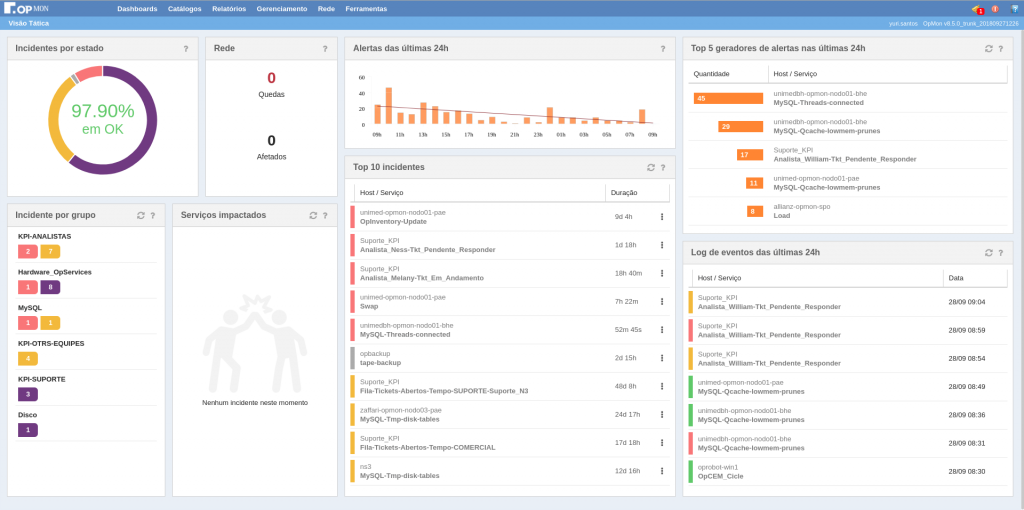
With the release of version 8.5, OpMon comes with a new Tactical overview Dashboard with a purpose to bring information relevant to monitoring and a flow of action. The Dashboard has 8 Widgets and in this post we will talk in detail about each one.
Before we start talking about each widget, in general each component has some common tools in the right of the title. The first icon ![]() has the function of updating the data, not all components have this icon, only the ones that will be updated in real time. By positioning the mouse over the icon, it will open a tooltip informing the last hour the data was updated. The second icon
has the function of updating the data, not all components have this icon, only the ones that will be updated in real time. By positioning the mouse over the icon, it will open a tooltip informing the last hour the data was updated. The second icon ![]() is just to guide the user and by positioning the mouse on it will open a tooltip containing information about the widget.
is just to guide the user and by positioning the mouse on it will open a tooltip containing information about the widget.

Now that we know the common tools of every widget, let’s see each one.
Incidents by state

This widget has an overview of all elements monitored in your OpMon, you will have the percentage of elements in each state and in the center shows how many percent in OK. Placing the mouse over a state will reveal how many percent of elements are in that state. You have the possibility to click on a state and will show the list of elements filtered by the state.
Network
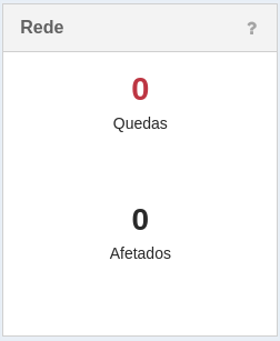
This widget shows how many elements had a network crash and how many devices affected by any of the crashes. Clicking will show the listing of falls.
Alerts last 24h

The alerts widget will represent the number of hourly alerts in the last 24 hours via a bar graph. Clicking on a bar will show all events that occurred at that time. By positioning the mouse above a bar, it will open a tooltip telling you the exact amount of alerts that occurred within that range.
Top 5 alerts producers last 24h
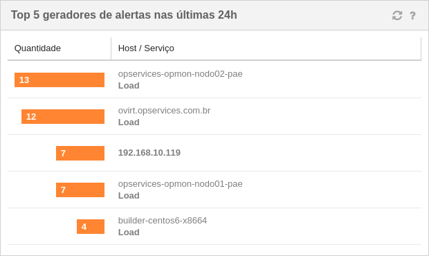
The alerts producer widget will tell you what elements in OpMon are generating the most alerts in the last 24 hours, the widget table shows the amount and name of the Host and / or service. Clicking on an element will show detailed information.
Incidents by group
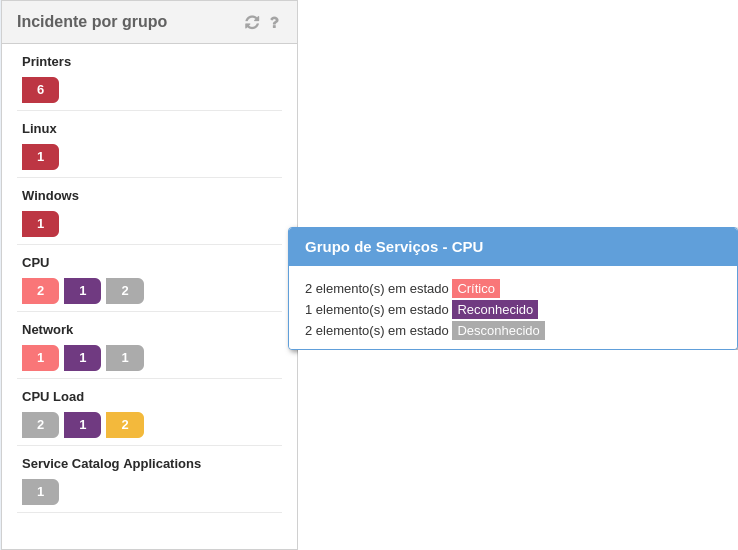
This widget shows the total number of incidents per group sorted by quantity and status priority. Clicking on a line will show the list of group elements.
Impacted IT services
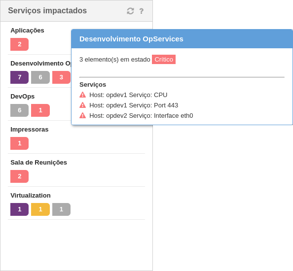
Widget with a list of services that have been impacted separately by the state. By positioning the mouse on one of the states, it will open a tooltip containing the name of the impacted services
Top 10 incidents
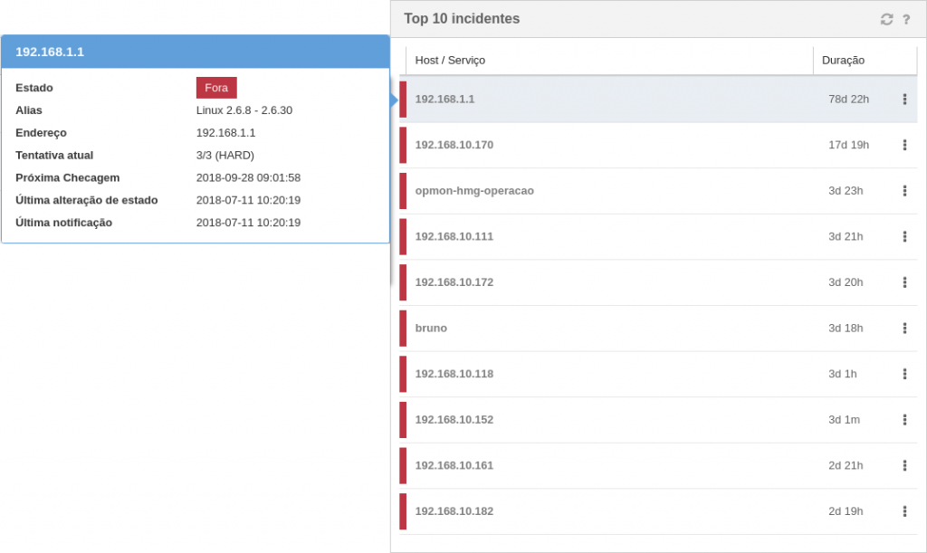
Listing the last 10 incidents with the longest duration and sorted by status priority. Placing the mouse over an element will open a tooltip containing more detailed information about the element. Clicking on an element will show more element information, topology, commands, etc. Through the tactical view dashboard, in the top 10 incident widget, you can enter a action or scheduled downtime for the element by clicking the icon![]() .
.
Event log last 24h
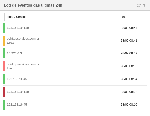
A list of the last 7 events that occurred in the last 24 hours. The widget table shows the state of the element in that event, Host name and / or service, and the date of the event. Clicking on an element will show detailed information.
Conclusion
With the new Tactical View Dashboard our goal is to deliver information that can assist people in a better IT management, every suggestion and critique of OpMon users is of great value to Opservices. For suggestions or questions you can open a topic here.